What is the Parse.ly Headline and how is it determined?
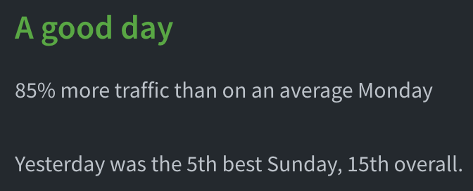
In the top left corner of the Overview, you may notice a qualitative sentiment that stands out above the rest; this is the Parse.ly Headline. It is a phrase that summarizes your traffic performance for the day.
Parse.ly Headlines
Here are the possible keywords that may appear in your headline. They are often accompanied by time of day, e.g., “A very good morning”. Parse.ly defaults to celebrating your high traffic volume. However, we also understand that there are times when it is tragedy that leads to high traffic on your site. Therefore, we automatically apply a selection of neutral terms when we detect unfortunate keywords in your top traffic.
| Positive keywords | Neutral keywords |
|---|---|
| Exceptional | Abnormally high traffic |
| Great | High traffic |
| Very good | Busy |
| Good | Active |
| Fine | Fine |
| Business as usual | Business as usual |
| Slow | Slow |
Headline Calculations
Besides the tone of the Headlines, how do we determine the magnitude of keyword to apply?
First, we consider similar time periods, e.g., Tuesdays from midnight until now. Second, we consider standard deviation from the normal traffic flow for that day. And with this logic, we examine the last eight weeks of your data.
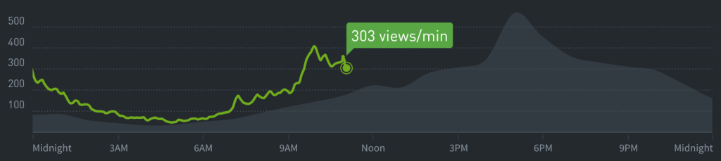
To help you visualize all of this, the real-time graph displays your average traffic (of this day over the previous eight weeks) as a grey area chart. You can monitor your real time traffic by watching the green line and seeing how it compares to the grey area. The Parse.ly Headline will provide a qualitative sentiment that compares today with your historical performance.

Other comparative data
There are other places besides the Parse.ly Headline and real-time graph to get comparative data. Our historical charts also provide for week-over-week or month-over-month comparisons.
Additionally, we’ve scattered Factoids throughout the dashboard on pages like the Overview, Posts, Authors, etc., you can hover your cursor over the Parse.ly metrics to get more detail about them. In the following screenshot, we can see that the average number of visitors is 383,624.75. If we hovered over “615k” we would see that there are 615,049 visitors on this day.
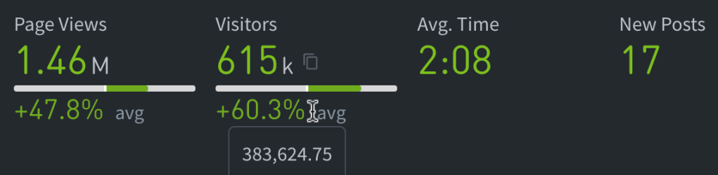
With these values we could calculate the relative change, i.e., ((new_value – old_value) / old_value) * 100%. In this case, we calculate that ((615049-383624.75)/383624.75)*100% = 60.3%.
Learn more about calculations in Parse.ly.
Want to compare more data? Check out Comparison Mode, Benchmarks, and Reports.
Last updated: April 03, 2024