Comparison Mode
Comparison mode allows you to see the “before and after” results of your work. It allows you to compare one time period of results against another time period of results.
For example: “How did the traffic change for our webpage this month versus last month?” If you had made changes to the webpage, you would now be able to easily source a number on the impact of those changes.
We are also calculating the results for you. Now, you don’t have to copy the numbers into another tool and do the math there, or try to mentally divide numbers like 47,217 by numbers like 35,609. Parse.ly will do it for you, and display it in a convenient percentage, right there in the dash.
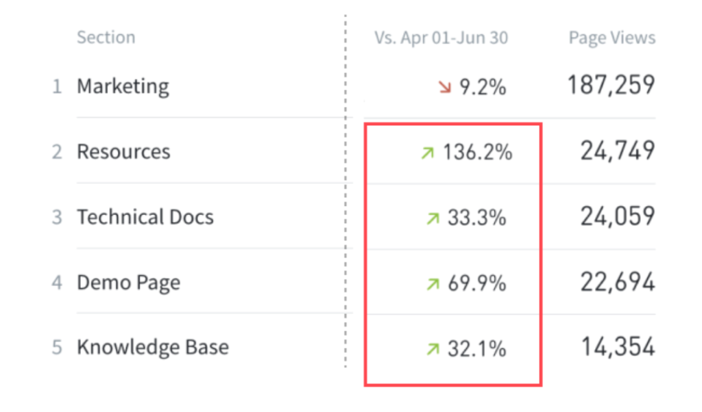
Above, you can see that for the time periods being compared, Resources page views increased by 136 percent compared to the previous time period.
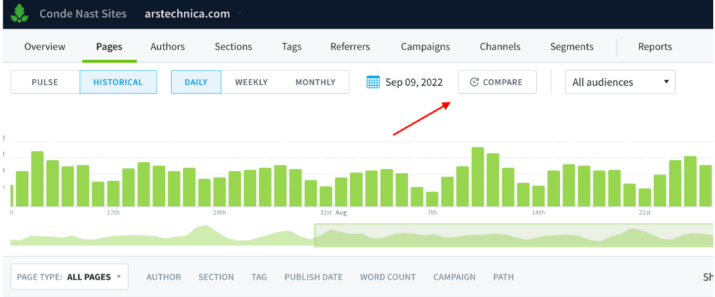
You can use it with posts, authors, sections and tags pages in Parse.ly. This is viewed first by opening the “Historical” time period, and then by selecting “Compare.”
You can compare time periods for posts, authors, sections, and tags, using every available metric in Parse.ly.
Who can use it?
Everyone with access to the Parse.ly dashboard can use comparison mode.
Where is comparison mode in the Parse.ly dashboard?
Click on the posts, authors, tags, or sections tab in the Parse.ly dashboard. Make sure you’ve selected historical mode. Then select the new compare button.
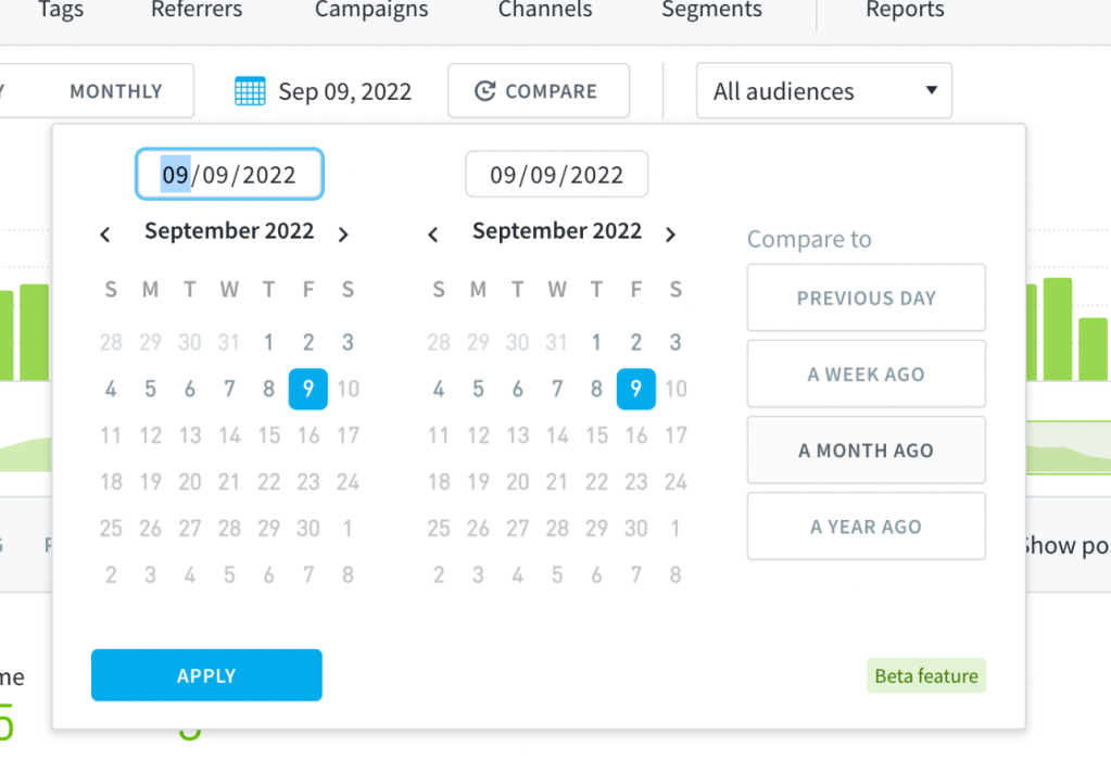
From there you can select what you’d like to compare your current selection to. Presets exist for different intervals of time, and a calendar is available for custom date selection.
What should I do with comparison mode?
For content teams, performance (success) is measured in context to other time periods. Did this post perform better after we made SEO changes to its metadata? Is content on X topic performing better this month than last month? How did our additional efforts on the marketing blog perform this quarter versus last?
With this new filtering mode, you can compare two time periods for a post, author, tag or section directly in the dashboard. We calculate the difference for you so you can spend your time elsewhere. With comparison mode, it’s easier for you to pick up trends across your site, better understand your evergreen performing content, and more easily find outlier performance across your data points.
Without comparison mode, you have to answer those questions by tracking and calculating data manually. Many of you shared that process with us over the years, how you exported data for two time periods, then manually calculated trends across time in another tool, like Excel or Google Sheets. We hope that this improvement to your dashboard relieves you of that manual effort.
What if I have questions or need help?
If you have feedback on the feature itself, including ideas on how to make it better, contact our product team at research@parsely.com.
If you are experiencing issues with the filter, or need help making the most of it in your account, please contact your relationship manager. As a last resort, you can also email support@parsely.com.
P.S.
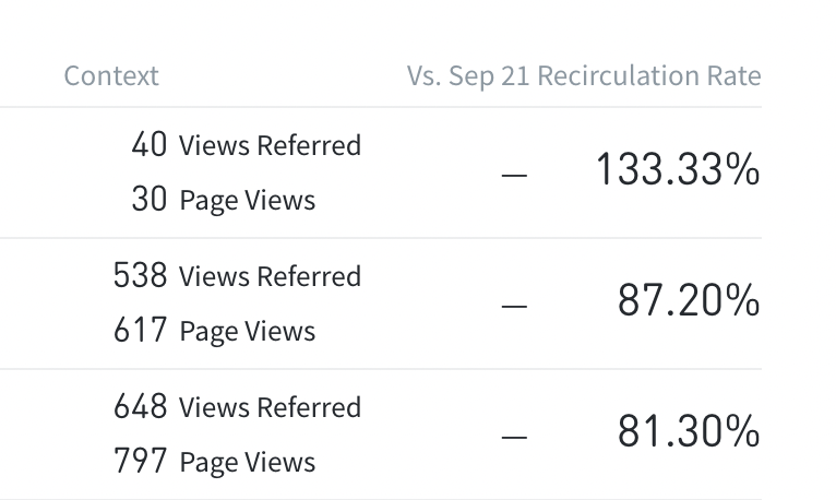
Not yet available: as of right now, please note that comparison mode will not work for videos, author groups, or recirculation rate. It can also not be exported. We know those are important to you, and we are working on it!
Seeing dashes? This means there is no data to compare.
Last updated: November 08, 2024