Parse.ly Signal
Signal is an alternative Overview in the Parse.ly Dashboard. It scores content on a 1–5 (quintile) scale by comparing KPI values against a site’s own historical data. Instead of showing raw counts like page views or visitors, Signal converts metrics into relative scores, benchmarking a post against the site’s baseline.
Signal answers the question: “Is this content working?”
The page ranks posts published in the past 24 hours across key performance indicators (KPIs), benchmarked against 90 days of the site’s historical data. Scores refresh every 30 seconds as new traffic arrives.

Accessing Parse.ly Signal
Signal is available from the Dashboards menu in the navigation bar. To access it:
- Click the Dashboards menu in the top left of the navigation bar.
- Select Signal from the dropdown options.

Availability
Signal is a permissioned feature. Access depends on user role and site settings. For details on feature permissions and how to request access, see Roles and Permissions.
Prerequisites
To display scores, a site must meet minimum data requirements:
- At least seven days of publishing activity within the 90-day window
- At least 30 total posts published within the 90-day window
Sites below these thresholds do not receive scores because there is insufficient data for meaningful percentile comparisons.
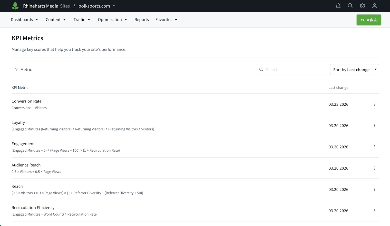
The KPIs
Signal evaluates content across KPIs. Each captures a different dimension of content performance.
Viewing KPI formulas
Hover over any KPI name in the column header to display a tooltip showing the formula used to calculate that KPI.
Reach
What it measures: How broadly content is discovered and distributed across the web.
Formula:
(0.5 × visitors + 0.3 × views) × (1 + referrer_diversity / (referrer_diversity + K))Raw metrics:
| Metric | Definition |
|---|---|
visitors | Unique visitors to the post |
views | Total page views for the post |
referrer_diversity | Count of unique referrer URLs that sent traffic to the post |
K | Smoothing constant (50). Controls how quickly the diversity bonus grows. |
How it works: The formula blends audience size—weighting unique visitors (50%) more heavily than raw page views (30%)—and multiplies by a diversity bonus. The diversity term rewards content that attracts traffic from many different sources rather than depending on a single channel.
The diversity bonus grows quickly at first but flattens out. With K = 50, increasing from five to 50 diverse referrers produces a significant score improvement, while increasing from 200 to 500 produces a smaller effect.
Why it matters: A high Reach score indicates the post is attracting a broad audience from diverse sources—not just driving clicks from a single channel. This signals strong distribution across the web.
Audience Reach
What it measures: A combination of total audience breadth (visitors) and total attention volume (views). This metric is similar to Reach but excludes referrer diversity.
Formula:
(0.5 × views + 0.5 × visitors)Raw metrics:
| Metric | Definition |
|---|---|
visitors | Unique visitors to the post |
views | Total page views for the post |
Engagement
What it measures: How deeply visitors interact with content, regularized against your past data to ensure more reliable results.
Formula:
(engaged_minutes + prior × K) / (views + K) × (1 + recirculation_rate)Raw metrics:
| Metric | Definition |
|---|---|
engaged_minutes | Total engaged time spent on the post (in minutes) |
views | Total page views |
prior | Site-wide average engaged minutes per view, computed from the top 10,000 posts (by views) over the last 90 days |
K | Smoothing constant (100). Controls how many views a post needs before its own data outweighs the site average. |
recirculation_rate | Proportion of sessions that continue to another page on the site after viewing this post |
How it works: This formula uses a statistical technique called Bayesian shrinkage to prevent low-traffic posts from producing misleading scores.
Bayesian shrinkage addresses this by blending the post’s actual data with the site’s baseline:
- The prior (numerator addition): Represents what a “normal” post on the site looks like before real data is observed.
- K = 100 (denominator addition): A post with fewer than approximately 100 views is scored mostly on the site average. A post with thousands of views is scored almost entirely on its own merits.
When views are low, the prior dominates. As views grow, the prior becomes negligible, and the post’s real engagement rate takes over.
Recirculation multiplier: Provides a proportional boost to content that sends visitors to other pages. A 0% recirculation rate produces no effect; a 50% recirculation rate produces a 1.5× boost.
Why it matters: A high Engagement score indicates that visitors are spending meaningful time with the content and exploring further, rather than bouncing after a headline skim. This signals genuine editorial value beyond headline curiosity.
Loyalty
What it measures: How effectively content drives return visits and keeps returning visitors engaged.
Formula:
(engaged_minutes_returning / visitors_returning) / (visitors_returning / visitors)Raw metrics:
| Metric | Definition |
|---|---|
engaged_minutes_returning | Total engaged time from returning visitors |
visitors_returning | Number of returning (non-new) visitors |
visitors | Total unique visitors |
How it works: The numerator (engaged_minutes_returning / visitors_returning) is the average engaged time for returning visitors—the same metric displayed as “Avg. Time Returning Visitors” when filtering the post listing by returning visitors in the Dashboard.
Dividing by the ratio of returning to total visitors normalizes the score, so posts are not penalized simply for having a smaller proportion of returning visitors.
Why it matters: A high Loyalty score indicates content that brings visitors back and keeps them engaged longer when they return. This signals the foundation of a sustainable audience strategy—habitual readership.
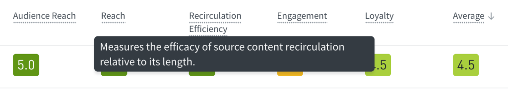
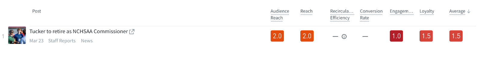
Recirculation Efficiency
What it measures: How effectively content keeps visitors moving through the site relative to its length.
Formula:
(engaged_minutes / word_count) / recirculation_rateRaw metrics:
| Metric | Definition |
|---|---|
engaged_minutes | Total engaged time spent on the post |
word_count | Number of words in the post (from metadata) |
recirculation_rate | Proportion of sessions continuing to another page |
How it works: Dividing by the recirculation rate surfaces posts that achieve high engagement per word without relying on high recirculation to stand out. This highlights deep-read content rather than click-through content.
Edge case: If a post has no word count metadata, it receives a score of 1.0 due to insufficient data.
Why it matters: A high Recirculation Efficiency score indicates content that earns its length—visitors stay engaged and continue exploring, even on longer pieces. This is valuable for ad impressions, subscription conversion, and overall site engagement.
Conversion Rate
What it measures: How effectively content drives desired actions.
Formula:
conversions / visitorsRaw metrics:
| Metric | Definition |
|---|---|
conversions | Total conversion events on the post |
visitors | Total unique visitors |
How it works: This straightforward ratio measures the proportion of unique visitors who completed a defined conversion action.
Prerequisite: The site must have Content Conversions configured to track conversion events. The definition of “conversion” is determined by the site’s implementation—this could be a subscription signup, newsletter registration, account creation, or another goal.
Why it matters: A high Conversion Rate score directly ties content to business outcomes. This is often the most important KPI for sites focused on subscription growth or lead generation.
Average Rating
The average rating displayed for each post averages the selected KPI scores, rounded to the nearest 0.5. When fewer than five KPIs are displayed (see Customizing the view), the overall rating averages only the visible KPIs.
How scores are calculated
Percentile baseline
For each site, Parse.ly examines every post published in the last 90 days and computes the raw value for each formula. This creates a distribution representing “what’s normal for this site.”
Scoring is entirely relative to the site’s own content. A score of 4.0 at one site may represent a very different raw value than a score of 4.0 at another site. This design means scores answer “how does this post compare to other content on this site?”—not “how does this post compare to the industry.”
Percentile boundaries
From the 90-day distribution, Parse.ly calculates eight percentile boundaries: p20, p30, p40, p50 (median), p60, p70, p80, and p90.
Each post’s raw value is compared against these boundaries to assign a score:
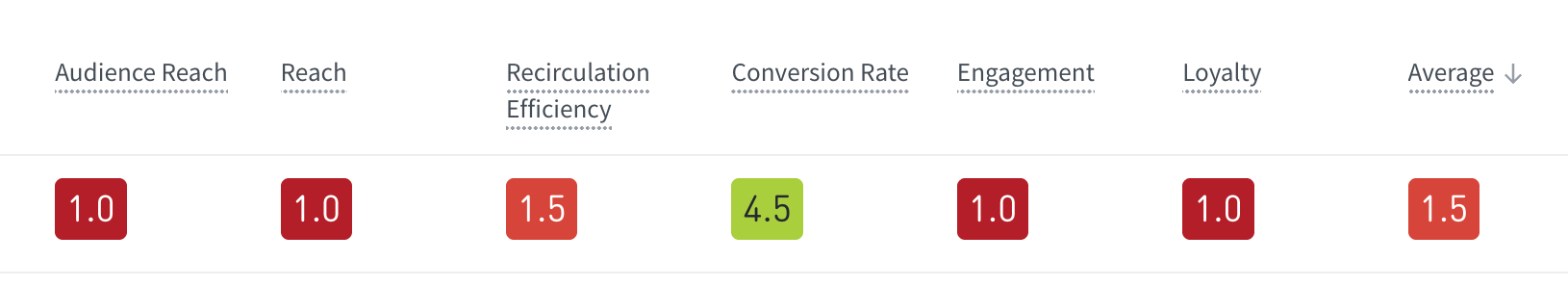
| Score | Condition | Color | Interpretation |
|---|---|---|---|
| 5.0 | ≥ p90 | Green | Top 10% — Exceptional |
| 4.5 | ≥ p80 | Yellow-green | Top 20% |
| 4.0 | ≥ p70 | Yellow-green | Top 30% |
| 3.5 | ≥ p60 | Yellow | Top 40% |
| 3.0 | ≥ p50 | Yellow | At or above median — Average |
| 2.5 | ≥ p40 | Orange | Below median |
| 2.0 | ≥ p30 | Orange | Bottom 40% |
| 1.5 | ≥ p20 | Red-orange | Bottom 30% |
| 1.0 | < p20 | Red | Bottom 20% — Below baseline |
Understanding the color gradient
Signal uses a color gradient to provide immediate visual feedback. Scores display on a spectrum from red (lowest scores) through orange and yellow (middle scores) to green (highest scores). This gradient allows quick scanning of content lists to identify performance patterns without reading individual numbers.
How to interpret scores
- 5.0 — Exceptional: The post is in the top 10% of all content published on the site in the past 90 days for this KPI.
- 3.0 — Average: The post performed at or above the median for the site.
- 1.0 — Below baseline: The post is in the bottom 20% for this KPI.
Scores are relative, not absolute. They answer “how does this post compare to other content on this site?” rather than providing an industry-wide benchmark.
Data freshness and update cadence
| Data type | Update frequency |
|---|---|
| Post listing (raw KPI values and scores) | Every 30 seconds |
| Percentile boundaries (historical baseline) | Every 24 hours |
The percentile boundaries use a rolling 90-day window, so they always reflect the most recent historical data. Because boundaries update daily, a post’s score may shift slightly from one day to the next as the baseline recalibrates, even if the post’s own traffic remains unchanged.
Customizing the view
Signal offers several customization options to tailor the display to specific workflows and preferences.
Selecting which KPIs to display
Not all KPIs need to appear in the view. To customize which KPIs are shown:
- Click the Customize Metrics button above the post listing.
- Select or deselect individual KPIs to include or exclude them from the view.
- Click Apply to save changes.
When two or more KPIs are selected, the average rating column is displayed, and posts are sorted by best-performing based on the average of the visible KPI scores.
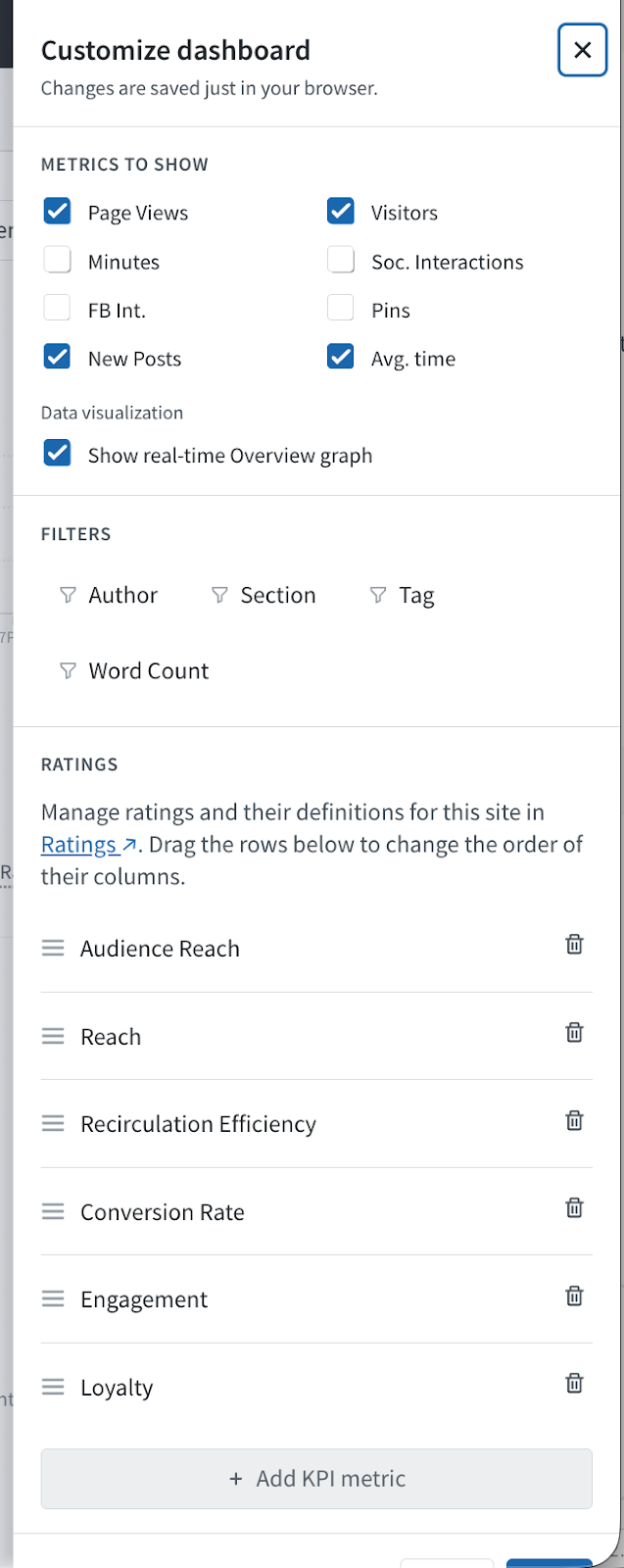
Choosing factoid metrics
The factoid row above the post listing can display different metrics. Click Customize Metrics to select which factoids appear. This works the same way as customizing factoids in the Overview tab—see Overview tab documentation for details on available factoid options.
Including or excluding the real-time graph
The real-time graph that appears at the top of the page can be shown or hidden. This graph displays the same real-time traffic data as the Overview tab. Toggle the graph visibility in the Customize Metrics panel.
For more information about the real-time graph and its features, see the Overview tab documentation.
Managing KPI settings
Site administrators can customize KPI names to align with internal terminology through the Ratings management page.
Accessing Ratings management
- Click the gear icon in the top bar to open the account menu.
- Select Settings.
- Navigate to Ratings in the settings menu.
Renaming KPIs
On the Ratings management page, administrators can rename any of the KPIs. Custom names appear throughout the Signal interface, including column headers and tooltips. This allows teams to use familiar terminology that matches internal workflows and reporting conventions.
Filtering and navigation
Signal supports filtering by:
- Author — View how an individual writer’s posts are scoring
- Section — Compare performance across content categories
- Tag — Filter by topic or editorial tag
- Segment — Apply audience segments to see how different audience groups interact with content
Important: Applying a filter changes which posts are displayed, but does not change the underlying scores. Scores are always calculated against the full site benchmark, ensuring consistency regardless of how the view is filtered.
Printing Signal
Signal can be printed or saved as a PDF for sharing or offline review. To print the current view, see printing data.
Signal vs. Overview
| Aspect | Overview | Signal |
|---|---|---|
| Shows | Raw metric values (visitors, views, engaged time) | Goal-oriented scores on a 1–5 scale |
| Answers | “How much traffic did this get?” | “Is this content working?” |
| Best for | Real-time operational awareness | KPI-driven editorial evaluation |
| Comparison basis | Absolute numbers | Relative to site’s 90-day historical baseline |
Use Overview for monitoring real-time traffic and understanding raw performance. Use Signal for evaluating whether content meets editorial and business goals relative to the site’s own standards.
Frequently asked questions
Why did a post receive a low score despite high traffic?
Scoring is relative to the site’s own baseline. A post with 50,000 page views may still score below 3.0 if the site regularly publishes content that exceeds 50,000 page views. The raw traffic may be substantial in absolute terms but below the site’s typical performance.
Why do scores not appear for a site?
The site has not met the minimum data requirements: at least seven days of publishing activity and at least 30 total posts within the 90-day window. Once these thresholds are reached, scores begin appearing within 24–48 hours as the background job populates the data.
How often do scores update?
Raw KPI values and scores refresh every 30 seconds. The percentile boundaries (the historical baseline used to convert raw values into scores) refresh every 24 hours.
What happens to posts older than 24 hours?
Posts older than 24 hours fall off the Signal listing, which ranks posts published in the past 24 hours. The 90-day historical data is used only for calculating percentile baselines—not for displaying older posts.
Is scoring the same across all sites?
No. Each site’s percentile boundaries are calculated from its own 90-day history. A score of 4.0 at one site reflects that site’s unique traffic patterns and content performance. This design ensures scores are meaningful comparisons to the site’s own standards.
Can Signal be viewed at the network or site group level?
No. Signal is available only at the individual site level. Network-level and site group-level views are not supported because percentile scoring requires a consistent baseline—mixing content from multiple sites with different traffic patterns and publishing volumes would produce misleading comparisons. To view Signal, select an individual site from the site selector in the navigation bar.
Why does a post show different scores on different days?
Percentile boundaries update every 24 hours using a rolling 90-day window. As new posts are published and older posts age out of the window, the baseline shifts. A post’s score may change slightly even if its own traffic remains unchanged, because the comparison baseline has evolved.
What if a post has no word count metadata?
For Recirculation Efficiency, posts without word count metadata receive a score of 1.0 due to insufficient data. Ensure metadata is properly configured through the site’s Parse.ly integration.
What can be customized?
Site administrators can rename KPIs through the Ratings management page in Settings. See Managing KPI settings for details.
Last updated: April 09, 2026