Pulse vs. Historical views
The tabs of the Parse.ly Dashboard have various view and filter options. The view can be changed from Pulse (real-time data) to Historical (long-term data) at the top left of most tabs (Posts/Pages, Authors, Sections, Tags, Referrers, Campaigns, Channels, Segments, Conversions).
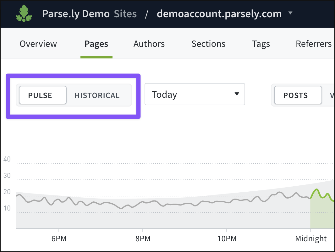
Dashboard tabs with the Pulse and Historical views first default to displaying Pulse. If the view has been switched to Historical in one tab, that will display the next time that tab or any other is opened.
The Overview and Reports tabs don’t use these views.
Pulse: Real-time data
Use the Pulse view in a Dashboard tab to see a line graph of real-time traffic data. If switched to Historical, click “Pulse” in the top left corner of the tab.
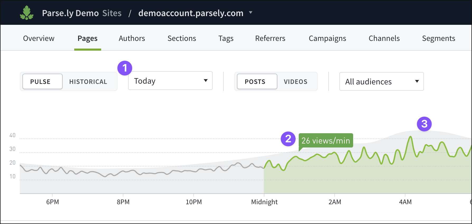
- Pulse defaults to displaying today’s real-time data. That time frame can be adjusted from five minutes to 24 hours in the drop-down menu.
- The line graph included in Pulse shows a green trend line of traffic during the selected time frame.
- The Pulse line graph also includes a gray area that reflects the eight-week trailing average of traffic.
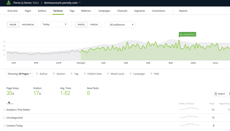
Hovering over an individual post, author, section, tag, etc. listed beneath Pulse’s line graph brings up an additional green area on the graph showing that item’s proportion of all traffic during the selected time range:
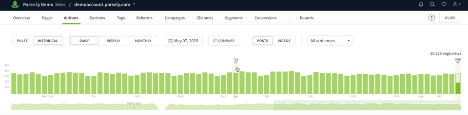
Historical: Long-term data
Use the Historical view in a Dashboard tab to see a bar graph of long-term traffic data. If switched to Pulse, click “Historical” in the top left corner of the tab.
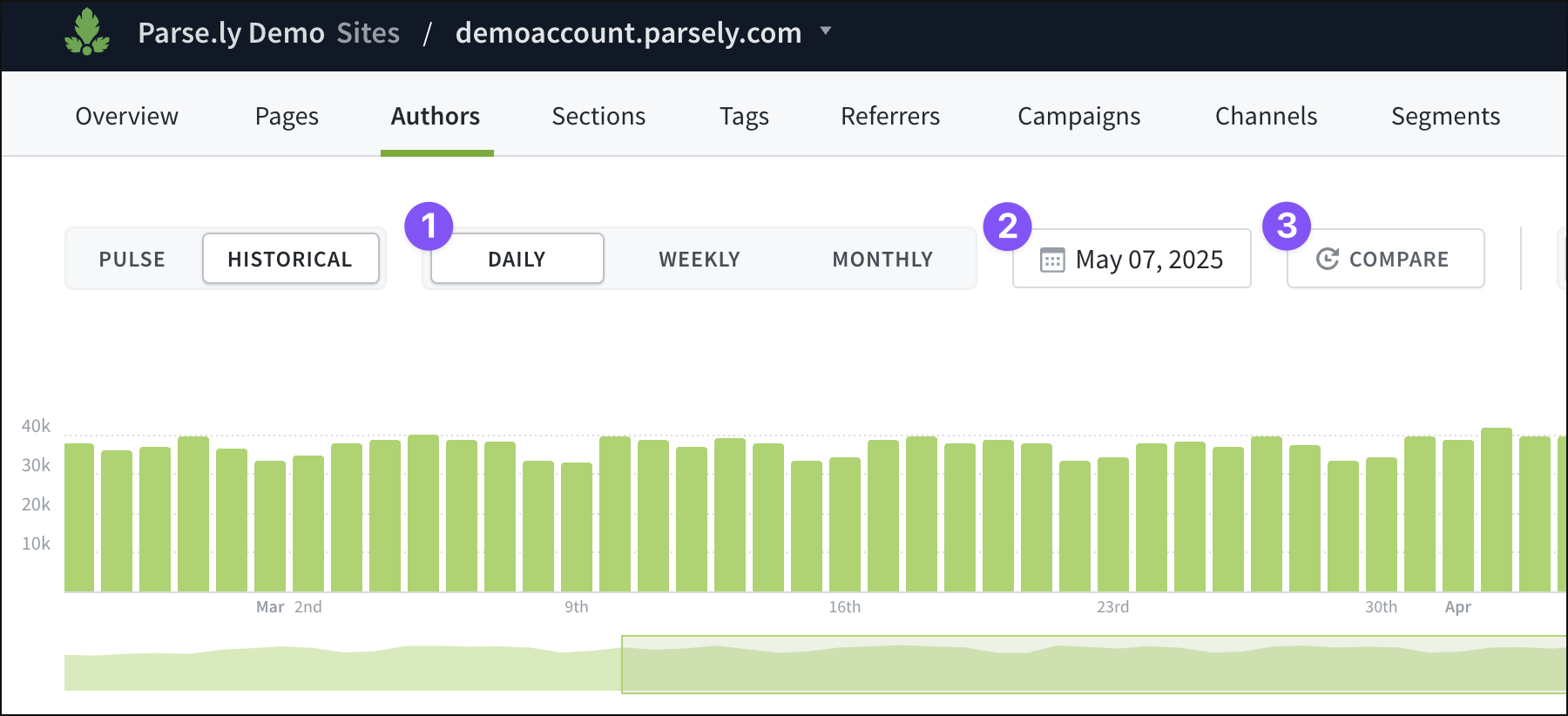
- Historical defaults to displaying the current day’s data. That time range can be quickly adjusted by clicking one of the “Daily,” “Weekly,” or “Monthly” presets.
- A date range can also be specified by clicking the calendar icon. Select specific start and end dates, or choose from presets between “Today” and “Last 12 Months.”
- The bar graph can also be clicked and dragged to select a date range. The line graph beneath the bar graph can be clicked and dragged to scroll through a wider date range for selection, as well.
- Click “Compare” to choose another time range to consider beside the primary time range selected. This comparison mode allows performance to be measured in context against other time periods.
Last updated: June 09, 2025