Overview tab
The Overview tab is the first tab seen after logging into the Parse.ly Dashboard. Overview shows a snapshot of what the audience is paying attention to during a set timespan, allowing fast content decisions. Read more about how numbers and data are calculated.
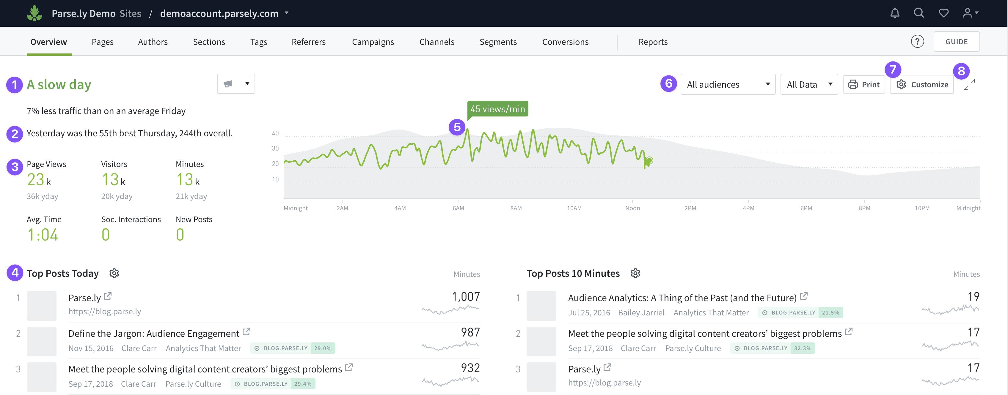
- Sentiment Headline: A brief summary that summarizes traffic performance. This can be turned off in the Customize panel.
- How the set time range compares to the past (since data tracking first started in Parse.ly). Adjust the time range in the Customize panel.
- Factoids for the set time range. Adjust which metrics are displayed here in the Customize panel.
- Listings show what’s getting the audience’s attention. Customize these by clicking the gear icons to the right of their headers.
- The real-time graph shows the set timeline metric based on the set time range. The green value is current, and the gray is historical for comparison (an average of the last 8 weeks or months, depending on time range settings). Adjust the timeline metric in the Customize panel. (This line graph becomes a bar graph when fewer than 20 views per minute are being logged.)
- Use these filters to refine Overview. “All audiences” in the first drop-down menu means you’re seeing all traffic for your site, network, or site group. You can also create up to five custom filters using the second drop-down menu here.
- The Customize panel allows configuration of Overview that’s saved only on the current browser.
- Click the expander icon to open a full-screen version of Overview for larger display on a TV or monitor.
Last updated: July 01, 2025